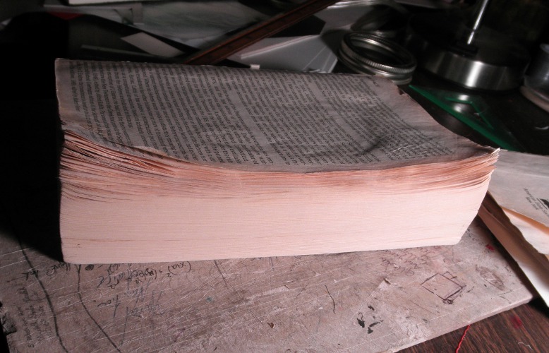
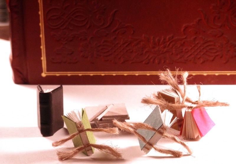
The Art of Racing in the Rain

This book was not what I expected, so I'm glad I read it before I bound it! For some reason I expected it to be about a dog who loves chasing things—you know, good old-fashioned foot-racing.

In fact, this turned out to be a charming, meaningful, and reflective book, written from a dog's perspective, with the rare power to hold my attention while talking about car races. It was reminiscent of the classic Zen and the Art of Motorcycle Maintenance, and certainly a worthy evening's read.
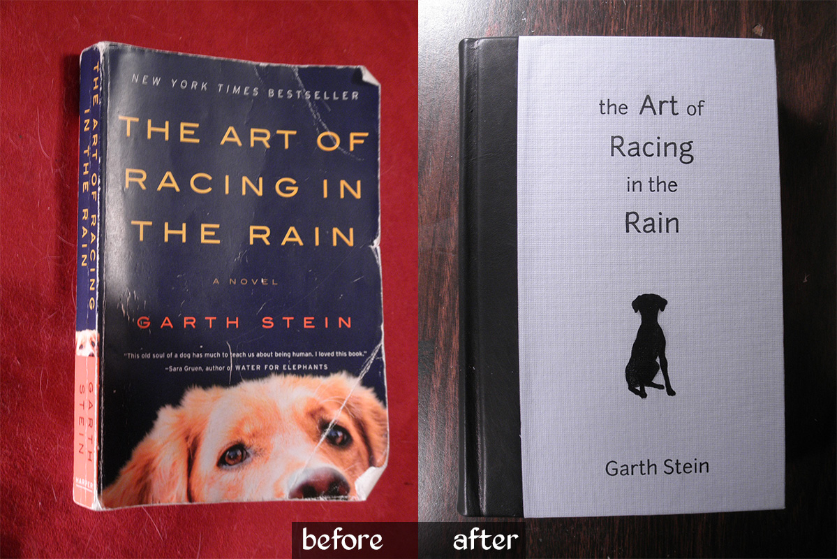
With three themes of its content in mind—dog as armchair philosopher, car races, and rain both real and metaphorical—I set about designing its new look. Enzo the dog takes the main focus, as on the standard cover, this time as a silhouette but with remarkably similar ears. The racing theme found its way onto the endpapers in the form of flying checkers, and a pale blue cover paper sets the rainy theme. For just a touch of class, I used black leather on the spine.


Oh, and I really love adding hand-stitched headbands to books.


I was a little crunched for time on this; my brother wanted it as a birthday present for a friend.  Were I to try again with more time, I'd add some silver detail on the cover—or maybe orange?  I do love blue and orange, and it would maintain more of the original look.

I'm also not entirely happy with the typesetting of the title. Normally I would spend hours obsessing over that!  I might have tried making the dog silhouette full bleed on the left, right against the black leather shoulders, with the title set more to the right... oh well.  It's done now, and all concerned parties have communicated their satisfaction.

Two things that went quite well this time were the spine and the insides of the covers.  I finally realized that I need to crease the shoulders so that the spine is much wider than the text block.  This gives the French grooves more definition, allows the book to open without wrinkling the leather, and gives me wiggle room so that the spine doesn't end up narrower than the rest of the book (a BAD problem).  As for the insides of the covers—by which I mean the cover material which wraps around to the inside—I achieved a very clean, even, square edge on both the paper and leather portions this time around.  Weirdly uneven lumps under the endpapers are not cool!

Metacrafting: the bookbinding workspace

The difference between a craft that I try once, think is really cool, but then don't keep up with, and one that I keep coming back to and improving my skills in, is a good workspace. The space I have is small – just a corner of my bedroom – but it has a few features that allow me to really focus and enjoy sitting down to work on my books.

First and foremost, there is ONE rule about the desk, only one, but it is unbreakable. The rule is this: No computers.

Ever.

Not mine, not my friends'. Not for a minute or an hour.

Laptops, iPads, tablets, they can go everywhere else in the world, but this is my ZONE, my artistic space. It is sacred and protected from the mundane ubiquity of technology, the cluttered space-hogging of keyboards, and the idle drudgery of facebook. (It's a little funny because my real work these days is as a web page designer, so I also work at creativity on a computer; but that has its own, different, space.)

There are no other rules for the workspace, not about keeping it clean and organized, or having only one project at a time, or anything like that, because I tend to find them stifling. I enjoy the primordial soup, as it were, of a busy desk area. I leave the organization to habit and necessity; it is a small enough space that things can't get too far out of hand.

Now for the actual physical features...

  1. Twin bright desk lamps: First of all, they're practical; overhead light alone is just not going to cut it. Having two of them allows me to move them around so they cancel each others' shadows. Second of all, when I sit down at my desk and lean forward to switch on these two lights, flooding my work area with all the photons I could ever want, it puts me in a mindset that I'm really working on stuff now, not fooling around half-heartedly. It's time to get in the zone.
  2. Rare earth magnet: You can't see it, but there is a large, cylindrical, neodymium magnet stuck to the base of one of the lamps. It holds my sewing needles and a collection of paperclips. Again, it's practical because it keeps me from losing track of sharp things somewhere in the chaos of the desk, and fun because, well, magnet! Done sewing – snick!
  3. Cutting board: The board in the center of my desk is my main work surface. It protects the wooden desk underneath from glue and knife blades, offers a convenient writing surface for calculations and quick sketches, and hold a place against the encroaching chaos of the tools and materials around it.
  4. Books: Kept close at hand on a hutch are the majority of the books I may need. The bottom shelf is full of instructionals and art books. Just above it is what I consider the "display shelf", with an assortment of Folio Society editions and other pretty bindings. It's good to have them close by for those moments when I need a role model or structural reference – and they work as a heavy, flat weight in a pinch.
  5. Paper, board, and cloth storage: I have paper in stacks in one of my desk drawers. I have a plastic sleeve tacked to the inside of the desk by my left knee, full of sheets ready to hand. I have huge rolls of paper leaning in a corner of the room, and a pile of boards and cheap kraft paper on the floor. None of it is more than eight feet from me at any moment.
  6. Cat – or more specifically, designated cat roost. It's a foregone conclusion that she is going to supervise my work. Might as well accept it and give her a place of her own. I'm always amazed that she, for her part, accepts the cushion.

Admittedly, this isn't quite the whole story. My dad, who shares my philosophy that a good craft needs a good space and good tools, has an entire basement room of the house devoted to woodworking. A surprising number of woodworking tools are very useful for bookbinding as well, so I make trips to the basement for certain portions of the binding process.

I would love to have a larger area – a huge slab of a table with cutting, gluing, and leather-skiving stations; whole storage bins full of supplies, with cubbies and shelves for all my paper sheets; space for a sewing frame and a book press; and a miniature workshop-within-a-workshop for gold leafing. It won't be happening any time soon and certainly not while I'm living with my parents, but it's something to work toward. For now I get along quite happily with my well-lit, magnet-endowed little space. I hope this maybe gave you some ideas for your own space!

Family Bible, part III: finished

Today I put the finishing touches on my commissioned re-binding of a paperback CCD Bible. I am extremely pleased with the results and I hope my client will be as well!

The plan was to use red Italian (Cialux) book cloth to cover the cover boards. While I love the look of this fabric, I was at first not entirely sure how I'd put a title on it—I don't have the tools or skills to gild it or screen print it, and the laser printer I used on the paper-covered Plato books would probably not work so well on cloth. However, I remembered back to Brian's Tome and decided the best thing to do would be an embossed look.

I was able to achieve this by cutting the letters out of a sheet of cardstock and pasting it over the front coverboard. The effect is subtle, but combined with the very bold lettering (traced directly from the original cover), it shows up well and has quite an impact. Unfortunately my camera is no good at capturing it—you need to hold it in your hands to really enjoy the effect.

As I mentioned in the previous post, I felt that this book would be incomplete without headbands. By an odd little bit of irony, I'm too lazy to get hold of machine-made headbands, so I defaulted to the more work-intensive task of handmade headbands.

These are stitched directly onto the text block, with the tie-downs passing between pages and through the kraft paper backing rather than through signatures. I used top-sewing upholstery thread over a core of whipping twine, and followed this excellent tutorial.

The book has a very nice profile when lying open. I think this may be the cleanest execution of covering and endpaper paste-down that I've managed so far.

Finally, my client had asked for me to incorporate the inside of the original front cover, if possible, because it had the family name written in it. So here is a shot of the old cover snuggled onto the inside of the new front cover—though I blurred the name for privacy.

Family Bible, part II

Work continues on the CCD Bible. The goal was to get most of the work done this weekend, and I did in fact get everything structural done. The first task was straightening out the curled page corners. First I tried pressing them, which did nothing, so I progressed to a medium-heat iron. That did the trick. The pages are not perfectly flat, but they are lying straight now and I'm thinking that, after they are pressed in the final stages, they will condense more.

With that taken care of, the text block was ready to be prepared for a hardcover structure. I tipped in the detached first two pages and then added endsheets on top of those. The endsheets are a plain but high-quality, ivory, 100% cotton paper; this seemed more suitable to the plain, functional purpose of the book than something with a pattern.

Once the endpapers were in place, I covered the spine with cheesecloth super and kraft paper after adding a marker ribbon. The text block is now ready for casing in -- at least, unless I figure out a way to add headbands, which I really want to do.

Meanwhile, the cover was coming together. The boards are 0.080" Davey board, pasted onto a manilla-folder spine per my usual construction. The next step is to cover them with cloth, but before that happens I need to try printing onto the cloth.

Stay tuned for the final stages: finishing the cover boards, and then using them to case in the text block!

Family Bible

Hello everyone! I haven't posted in a while -- I actually have sort of a day job now, which I absolutely love but it does leave me with less time to play around at home. I do, however, have a new project.

This paperback Bible was with my client and her siblings all through CCD school. It has suffered the complete detachment of its front cover, and the first 200 or so pages are curled at the corner.

The spine, however, is in surprisingly good shape, and most of the pages are intact despite the curling.

In its current state, this book is not fully usable, but the sentiment it carries makes it worth saving. I will therefore be reinforcing it and giving it a new, red cloth cover.

More pictures to follow as I progress.

Army book for Warhammer 40k - Lords of Oblivion

My friend Brian approached me a while ago with a new project idea. I've mentioned that he's an avid player of Warhammer 40k, a tabletop war game. He has put together many small armies' worth of plastic miniatures and has designed his own Chapter of Space Marines within the 40k universe: the Lords of Oblivion.

All the information pertaining to this Chapter—its history, descriptions of the major characters in the army, "fluff" as the players call it, and then all the stats and mechanics for actual gameplay—would constitute a small book. In fact, it does constitute a small book. That's where I come in.

Brian commissioned me to make a large, ornate book to hold the description of his army and all the reference material he needs during gameplay. The trick is that the pages need to be removable, in case he edits part of it later down the line. A 3-ring binder would suit this, but would break the illusion of being a real and proper book, so I decided to build the book like a photo album, using screwposts. This wonderful screwpost-construction grimoire served as my chief inspiration, and here's the working part of mine:

There's a narrow flap of paper that folds down over the screws to keep them hidden. The book will hold about 60 sheets of paper, which is more than plenty for Brian's needs.

The cover material is faux leather (vinyl)—yeah, I wish it were the real thing, too. The corner braces, however, are the real deal: chunks of metal riveted right onto the book. I took brass-plated angle braces from a hardware store and gave them a hammered finish using a ball-peen hammer. They're heavy; you really feel them as you open the book.

The gemstones are pearlescent snap heads with the snap portion filed off. They're epoxied in place and unlikely to budge. The rivets were cut off a 3/16" brass rod and peened over, and can I just say that hammered rivets are drop-dead sexy?

Brian did all the typesetting for the interior. The original plan was to print everything on parchment paper, but we ran up against a time crunch and he had to make do with a first run of plain printer paper. The lore isn't actually completely written, yet; I'm hoping that, when he finishes it up, he'll be able to do a more official run on the nice paper.

Okay, so that's all the behind-the-scenes talk out of the way... let's do a quick evaluation. Good features: The color balance between the tan leather-look and the green gemstones and ribbon is very pleasing, and the heavy use of brass finish works nicely to dress up the book.

Bad features: I really don't like the lettering on the front. The goal for the book was a Gothic/sci-fi fusion, but those letters seem more to be fighting with the leather and brass than working with it. Brass cutouts might have worked better. The result is a sort of middle-school craft project clash of ideas on the front cover which needs to be smoothed out before the book can shine, though the foundation is good. I'd also like to paint the emblem directly onto the leather, or onto a thin sheet, rather than onto cardstock as it is now, for further streamlining. That said, I think the interior looks great and it's already gotten some compliments, so yay!

Anyway, I hope you like the book! Brian has a few more projects like this one for me, so expect more sooner or later. Cheers!

Tiny books are cute and anthropomorphic

I am making several tiny books to sell as pendants at an upcoming renaissance faire... I quickly discovered that they have an irresistible personality!


Here's Shep, a book dog.


He belongs to these bookly citizens.


Is that...a bird?  Or a plane?


A well-dressed stranger visits the town.
The bookly citizens gather to admire her gilded wardrobe.


Shep finds something interesting.


The book boards for everyone's hard covers have arrived!  Everyone gathers to see, and the town elder claims the podium to regale them with his tale of The Day I Earned My Covers.


Suddenly, in the middle of his tale -- a GOD descends -- !
The citizens stumble backward in awe!


While the others stand frozen, the town elder steps forward, fearless.
"Are you sure that's wise?" protests the gilded newcomer.
"Perhaps not, but the spirit of ADVENTURE compels me!"


The bookly god is benevolent and takes them to see the Promised Land of Bookshelf. Someday, when all the bookly citizens have earned their covers, they will come here to live among the great ones.

To be continued...