Showing posts with label finished products. Show all posts

A Little Princess

Last summer I wanted to re-bind a bunch of old paperbacks. I finished Wuthering Heights by Emily Brontë, then started on A Little Princess and a compilation of Emerson's essays. I got to the point of needing to decorate the covers, felt stumped, and got distracted with other things.

A couple nights ago, riding on momentum from finishing up another project, I finally felt inspired and started working on the Princess binding.

I was really going for the Princess theme here.

I was careful to get photos of every step in the process on this book, so now I have a montage of my paperback re-binding process.

I start by stripping off the old cover and sanding the spine down to the glue. To reinforce the spine, I sink hemp cords about 1/8" in, through the glue and just a little into the paper. Endpapers are tipped in at this point, and then it's on with the super and lining. Hand-stitched headbands complete the text block.

Meanwhile, I assemble the case by fitting new cover boards onto a piece of manila folder. This gets covered and decorated before it is finally ready to attach to the text block. Everything goes together, sits overnight under pressure, and the process is complete!

By the way, this book is available for sale here.

Another Bible re-bind: full leather

It seems that, in the province of books with sentimental value which are falling apart and need an inexpensive re-bind, Bibles are king.

That's all right though. Someone who wants a not-too-fancy leather binding is someone giving me a chance to practice simple bindings in leather, and there is no greater pleasure than working with genuine bookbinding leather.

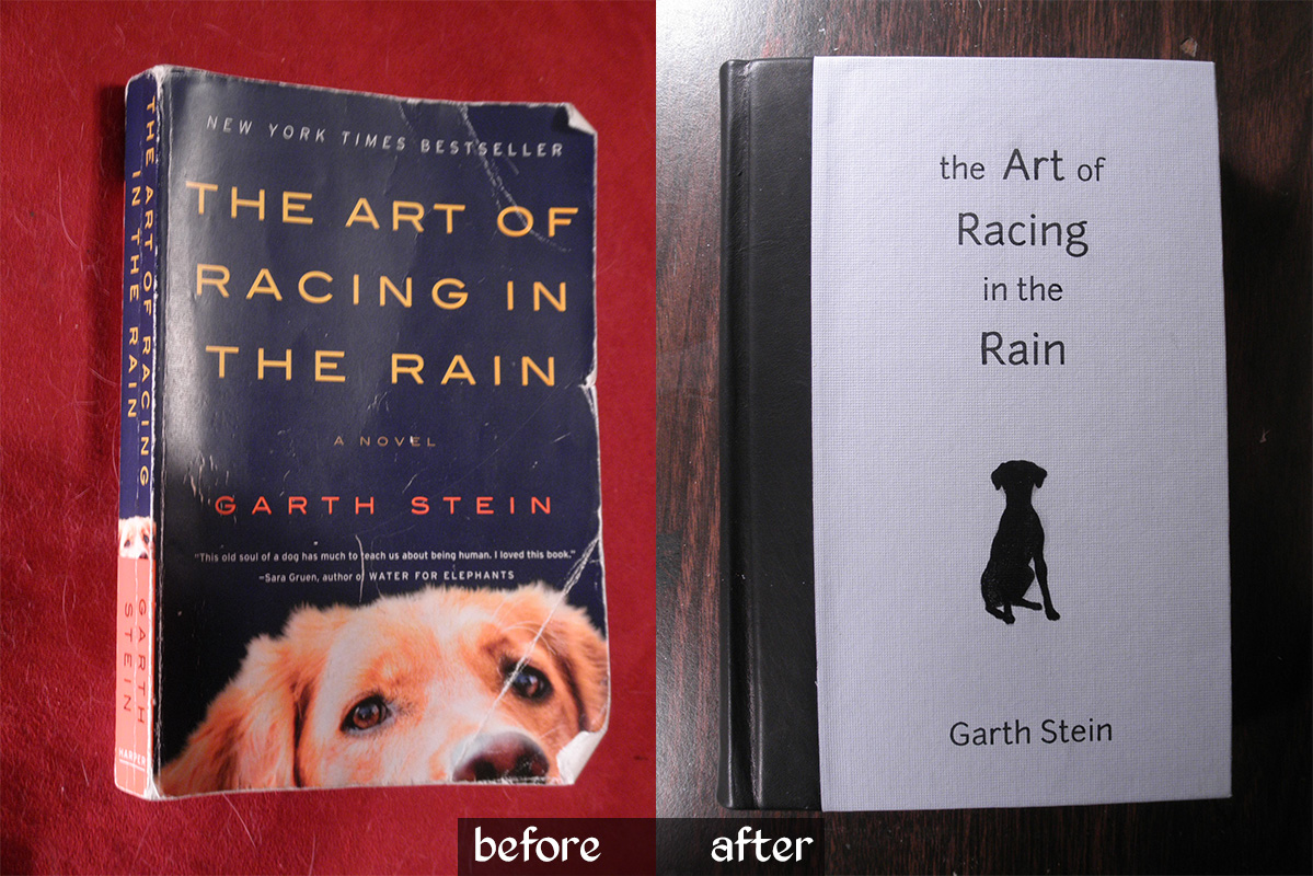
The Art of Racing in the Rain

This book was not what I expected, so I'm glad I read it before I bound it! For some reason I expected it to be about a dog who loves chasing things—you know, good old-fashioned foot-racing.

In fact, this turned out to be a charming, meaningful, and reflective book, written from a dog's perspective, with the rare power to hold my attention while talking about car races. It was reminiscent of the classic Zen and the Art of Motorcycle Maintenance, and certainly a worthy evening's read.

With three themes of its content in mind—dog as armchair philosopher, car races, and rain both real and metaphorical—I set about designing its new look. Enzo the dog takes the main focus, as on the standard cover, this time as a silhouette but with remarkably similar ears. The racing theme found its way onto the endpapers in the form of flying checkers, and a pale blue cover paper sets the rainy theme. For just a touch of class, I used black leather on the spine.


Oh, and I really love adding hand-stitched headbands to books.


I was a little crunched for time on this; my brother wanted it as a birthday present for a friend.  Were I to try again with more time, I'd add some silver detail on the cover—or maybe orange?  I do love blue and orange, and it would maintain more of the original look.

I'm also not entirely happy with the typesetting of the title. Normally I would spend hours obsessing over that!  I might have tried making the dog silhouette full bleed on the left, right against the black leather shoulders, with the title set more to the right... oh well.  It's done now, and all concerned parties have communicated their satisfaction.

Two things that went quite well this time were the spine and the insides of the covers.  I finally realized that I need to crease the shoulders so that the spine is much wider than the text block.  This gives the French grooves more definition, allows the book to open without wrinkling the leather, and gives me wiggle room so that the spine doesn't end up narrower than the rest of the book (a BAD problem).  As for the insides of the covers—by which I mean the cover material which wraps around to the inside—I achieved a very clean, even, square edge on both the paper and leather portions this time around.  Weirdly uneven lumps under the endpapers are not cool!

Family Bible, part III: finished

Today I put the finishing touches on my commissioned re-binding of a paperback CCD Bible. I am extremely pleased with the results and I hope my client will be as well!

The plan was to use red Italian (Cialux) book cloth to cover the cover boards. While I love the look of this fabric, I was at first not entirely sure how I'd put a title on it—I don't have the tools or skills to gild it or screen print it, and the laser printer I used on the paper-covered Plato books would probably not work so well on cloth. However, I remembered back to Brian's Tome and decided the best thing to do would be an embossed look.

I was able to achieve this by cutting the letters out of a sheet of cardstock and pasting it over the front coverboard. The effect is subtle, but combined with the very bold lettering (traced directly from the original cover), it shows up well and has quite an impact. Unfortunately my camera is no good at capturing it—you need to hold it in your hands to really enjoy the effect.

As I mentioned in the previous post, I felt that this book would be incomplete without headbands. By an odd little bit of irony, I'm too lazy to get hold of machine-made headbands, so I defaulted to the more work-intensive task of handmade headbands.

These are stitched directly onto the text block, with the tie-downs passing between pages and through the kraft paper backing rather than through signatures. I used top-sewing upholstery thread over a core of whipping twine, and followed this excellent tutorial.

The book has a very nice profile when lying open. I think this may be the cleanest execution of covering and endpaper paste-down that I've managed so far.

Finally, my client had asked for me to incorporate the inside of the original front cover, if possible, because it had the family name written in it. So here is a shot of the old cover snuggled onto the inside of the new front cover—though I blurred the name for privacy.

Army book for Warhammer 40k - Lords of Oblivion

My friend Brian approached me a while ago with a new project idea. I've mentioned that he's an avid player of Warhammer 40k, a tabletop war game. He has put together many small armies' worth of plastic miniatures and has designed his own Chapter of Space Marines within the 40k universe: the Lords of Oblivion.

All the information pertaining to this Chapter—its history, descriptions of the major characters in the army, "fluff" as the players call it, and then all the stats and mechanics for actual gameplay—would constitute a small book. In fact, it does constitute a small book. That's where I come in.

Brian commissioned me to make a large, ornate book to hold the description of his army and all the reference material he needs during gameplay. The trick is that the pages need to be removable, in case he edits part of it later down the line. A 3-ring binder would suit this, but would break the illusion of being a real and proper book, so I decided to build the book like a photo album, using screwposts. This wonderful screwpost-construction grimoire served as my chief inspiration, and here's the working part of mine:

There's a narrow flap of paper that folds down over the screws to keep them hidden. The book will hold about 60 sheets of paper, which is more than plenty for Brian's needs.

The cover material is faux leather (vinyl)—yeah, I wish it were the real thing, too. The corner braces, however, are the real deal: chunks of metal riveted right onto the book. I took brass-plated angle braces from a hardware store and gave them a hammered finish using a ball-peen hammer. They're heavy; you really feel them as you open the book.

The gemstones are pearlescent snap heads with the snap portion filed off. They're epoxied in place and unlikely to budge. The rivets were cut off a 3/16" brass rod and peened over, and can I just say that hammered rivets are drop-dead sexy?

Brian did all the typesetting for the interior. The original plan was to print everything on parchment paper, but we ran up against a time crunch and he had to make do with a first run of plain printer paper. The lore isn't actually completely written, yet; I'm hoping that, when he finishes it up, he'll be able to do a more official run on the nice paper.

Okay, so that's all the behind-the-scenes talk out of the way... let's do a quick evaluation. Good features: The color balance between the tan leather-look and the green gemstones and ribbon is very pleasing, and the heavy use of brass finish works nicely to dress up the book.

Bad features: I really don't like the lettering on the front. The goal for the book was a Gothic/sci-fi fusion, but those letters seem more to be fighting with the leather and brass than working with it. Brass cutouts might have worked better. The result is a sort of middle-school craft project clash of ideas on the front cover which needs to be smoothed out before the book can shine, though the foundation is good. I'd also like to paint the emblem directly onto the leather, or onto a thin sheet, rather than onto cardstock as it is now, for further streamlining. That said, I think the interior looks great and it's already gotten some compliments, so yay!

Anyway, I hope you like the book! Brian has a few more projects like this one for me, so expect more sooner or later. Cheers!

Plato's Makeover - completed

Good afternoon! I'm back, and I've brought books: two new hardcovers for a professor's library. Click for larger images:

My last post was a WIP shot of rebind work on my dad's Plato paperbacks, and now here are the finished products. They are perfectly matched. Their Greek titles, Gorgias and Politeia, were printed via laser printer onto the cover material and positioned over a rectangular piece of cardstock. Once the cover was glued, I used my bonefolder to find the edges of the cardstock, producing a raised effect.

The cover paper is a thick, creamy cardstock with metallic gold swirls, and the spines and corners are dark forest green (though they look a little black in these photographs). I went with navy blue for the endpapers, a paper with tiny bits of gold tinsel to pick up the metallics on the cover.

One of the books came with a special task. Dad has a little notebook that he used to keep binder-clipped to the back cover of the Gorgias, not a very permanent solution when the re-binding happened. So, I fashioned a pocket for the inside of the back cover which perfectly fits the notebook.

More projects to come soon. I'm working on a re-bind of A Little Princess which I will post as a photodocumentary of how the process works, and I've also got another big project from my muse of epicity, Brian.

Rebound paperback: Wuthering Heights

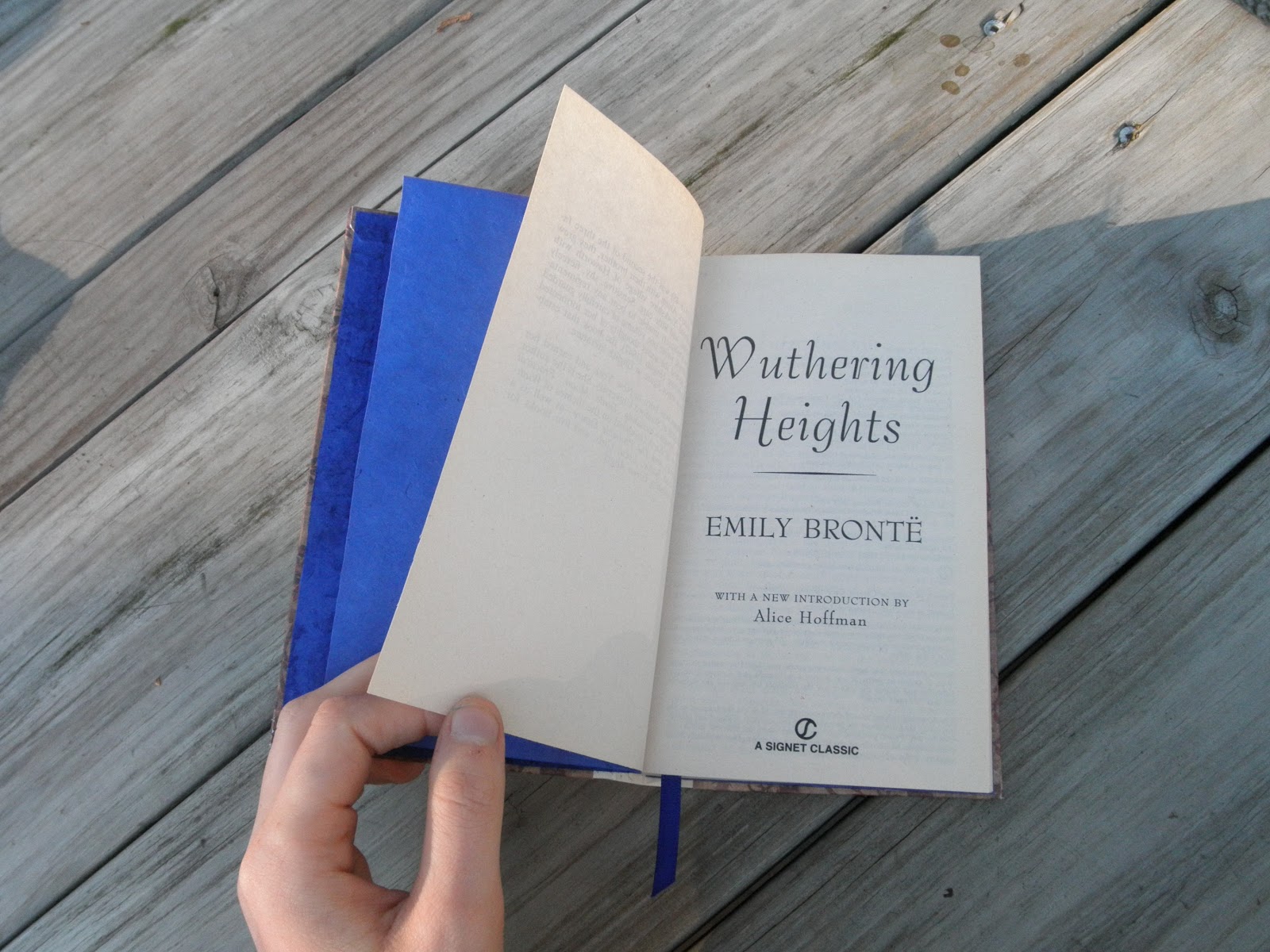
I was always more fond of Jane Eyre than I was of Wuthering Heights, but this paperback copy of Emily Bronte's classic novel was too inviting to pass up. It wanted a dark but romantic and thoroughly Victorian look.


I gave it the full treatment to make for a sound new hardcover: cords sunk and glued into the spine for strength, a cheesecloth hinge to attach the cover. Putting the cover together was something of a trial. I knew I wanted to use this floral brown printed paper with a cream spine and ivory endpapers. However, I didn't have a long enough strip of the cream paper to cover the spine, so I had to come up with the brown spacer strips you see in the final product.

Then there was the title. I'm not a practicing calligrapher, but I have practiced, I'm comfortable with an ink pen, and my natural handwriting isn't bad. So I inked a couple dozen practice titles before taking on the real thing. I'm happy with the result, but I wish I had practiced the sans-serif author name a little more; it was supposed to be cleaner and very blocky. Still, I'm pleased and I know I'll get better.

I was, however, extremely pleased to find a ribbon in precisely the same shade of indigo as the endpapers.

This book is available for sale from my Etsy store.

Sneaky dictionaries: French and German

The books I mentioned in my last post are now finished. I took a paperback French phrasebook and a German/English dictionary, removed their old covers, sanded down their spines, and treated them to hard covers. They are now case-bound books with cloth hinges. First up is Charles Berlitz's "Passport to French" phrasebook:

As I was deciding how to decorate the covers, I realized I had a perfect opportunity to make these books interesting: don't include a title. In fact, don't include any identifying marks at all. The result is an unobtrusive little hand-bound volume which can be carried the world over without advertising its owner as "not from around here."

Next we have the Bantam New College German & English Dictionary:

Again, stealthy, but the red, gold, and black marbled paper on the spine does subtly conjure the German flag. The book is unique and easy to spot on a shelf for the German student at home. It might make for a pretty gift to a German language student.

Here's a quick shot of the hollow spine I was so excited about in my last post:

Both dictionaries are available on my Etsy store (which also has more pictures).

Rose notebook

A quick update to show off my latest creation, a rose-themed notebook.


The cover was painted with metallic gold ink and then varnished. To my mild surprise but delight, the varnish picked up some of the gold color and carried it across the paper rose cutout, which is now slightly metallic as well.

The interior paper is all handmade (not by me). Half the pages are white with faint thread fibers, while the other half contain real rose petals on one side. In retrospect, I should have glued these pages with the petals facing down, to present the more writeable side of the paper. Still, the petals can be written around or notes can be taken on the reverse.


The pages are single sheets which can be torn out, making this useful as a notebook. The front cover is attached only to the back of the spine and can therefore fold out of the way behind the back cover. Here's a quick diagram of the structure:


This notebook is now available for sale on my Etsy store.

Tiny books

How to practice the techniques of bookbinding in a non-resource-intensive manner?


Tiny books!  Each is about 2.5" tall and 1.5" wide.  The pages were cut from sheets of tracing paper (which is suitably thin for this scale).


The first is a traditional book on raised cords with a scrap of leather on the spine, and scraps of marbled paper on the covers.  Observe: my first successful French groove!


For the second, I decided to try a coptic binding.  The first such binding I saw was a revelation; a book that shows off the stitching of its own spine?  Wait—you can do that?


Yes.  Yes, you can.  My first try was a little sloppy around the headbands, but I intend to get better.  Here's what it looks like from the inside:


I may add a ribbon to hold it closed; I think my stitches were a little too tight, because this one loves to fly open.  Like a puppy with an open door, I sweartogod.

The next project, currently in the works, is a rose-themed notebook with tear-out pages.  The paper is handmade and contains real rose petals.  Which...might be kind of hard to write on, but I'm counting on it being cool enough that nobody will mind.  (There aren't that many of them.)


The Tome, part VI: Completion

(Enter BINDER, who clears throat.)

BINDER: Allow me to present to you...the Tome, a hand-bound book in its final state.

(Enter BOOK.)

BINDER: It seems to be a little shy, but we'll soon fix that.  For the moment, you can see more here than you might think: the dapper red ribbon, the hand-stitched headband, a bit of Brian's handwriting, the pattern on the endpapers.  A book has a lot to say in its edges and corners.

Still, if you'll bear with me, perhaps I can convince it to show its cover.

(aside, whispering) Only a corner?  All right, that's fine, but you must get it together soon, promise? (addresses audience) We're still getting over our nerves, but here's a detail of the leather.  The headcap was shaped with a piece of yarn and the leather was pressed down around a knotwork relief on the front.  Now let's see if...

Aha!  So, it's not entirely spineless after all!  I think it may be ready.  Ladies and gentlemen...the leatherbound cover of Brian's Tome!

Here you see featured in relief the writer's coat of arms: a sword, two olive branches, and a shield.  Parts of the branches were stamped onto the leather; the rest was pressed down around those cardboard forms I so painstakingly carved.  Beneath you'll find the volume number.  That's correct, Volume I; for I don't expect this man to soon stop writing.  Perhaps next year I'll make Volume II and see how far my craft has come.

Lifting the cover, we get a look at the handsomely marbled endpapers. (As usual, you may click for a larger view of the image.)

Though not hand-marbled, these papers are a step above printed papers and no two are quite the same.  This picture lets you see how the endpapers, ribbon, and headbands have been coordinated in a red-black-yellow scheme.

Now, turning the page...

...we find that the book has been given a title—a nod to the Doctor's own Journal of Impossible Things.

The writer has already begun his work in this volume, but I'm afraid that's not yet ready for display.  We can hope that someday, perhaps, something written in this volume will be lucky enough to catch some publisher's eye; when that happens, I will most certainly show you the manuscript.

(BINDER gives a bow.  Exeunt BINDER and BOOK.)

Thanks for watching.

Go to: Part V | Retrospect

Silver bracelet

My last big craft obsession was with chainmaille. I was pretty deep in it; I kept an extensive set of tools and supplies, had an inventory of around 100+ pieces (some of them quite large and ring-intensive, some quite small and fine), booked tables at craft shows, even put together my own website and was writing tutorials for other artisans. That whole thing kind of just got dropped around the end of 2008, which coincides oddly with the start of my undergraduate career.

I kept all my tools and supplies, though, so as soon as I got a free moment I was able to pick it back up again. I thought I'd share the first thing I made in my resurgence: a simple but classic silver bracelet with a bar clasp.

It's made from 20 ga. sterling silver wire at a ring ID of 7/64". The weave pattern is the simplest and best known of chainmaille weaves, European 4-in-1, which was (and is) the most common armor weave. I'd like to make it a little wider, but with the current cost of silver I think I'll hold off on that unless someone specifically asks for it.

That's all for now. Stay crafty!

A new craft for an uncertain graduate

I have no idea what I want to do with my life, but until I figure that out at least I have a book titled Creative Bookbinding, by Pauline Johnson. I stumbled across this in a Barnes and Noble two summers ago, and the little wheels in my brain went "snick snick snick...whirrr?". Yes, mechanical analogies of my cranial matter can absolutely express a dizzying but wonderful uncertainty.

This is a leatherbound edition of the Lord of the Rings trilogy, and someday, I want to do THAT.

Between my involvement in the GV Writers' Club publication and my bent for crafts, bookbinding just seemed like the perfect idea, so I started my first project. I don't exactly recall what prompted my choice of poetry compiled from The Lord of the Rings, except that I was re-reading the trilogy at the time, so, duh.

There is a lot of poetry in The Lord of the Rings; I wound up with about 70 pages of text, which I formatted using the inestimable Adobe InDesign. Finally, after a trip to the school copy center, I had a lovely set of pages printed and trimmed to size. I folded them into five signatures, where each signature is a set of four sheets folded down the center and nested together.

I won't get into the mechanical details of binding the signatures and adding the covers, at least not just now. Assume it was magic. Poof! Two years later, my little book is complete! Why the hangup? The spine needs a special glue, and I couldn't find it online and/or was leery of buying hide glue. For two years. Yeah. The actual book took me maybe a week of work. But here it is! (Click for higher resolution.)

Placing it on top of Houghton Mifflin's 50th anniversary edition makes my little book look better by association.

This book was a prototype, a see-if-I-can project expecting more to follow if it works out. It did work out. So, what next? Here are my thoughts:

  • A journal for Brian. We saw a giant, black, leatherbound tome of a journal at a shop in Rome (yep, Rome). He wanted it; I said I could make him one. I will, and in time for his birthday on May 28.
  • Re-bindings of old trade paperbacks. Who wants a custom binding for their favorite childhood sci-fi/fantasy story? This girl, for one. I've been cautioned that the pages on such a book are typically fragile; however, I think I know how to do this in such a way as not to disturb them too badly.
  • A special run of past Running Out of Ink editions. Last winter, the Writers' Club hand-bound a portion of the copies of our publication using a fairly elementary paperback technique. I still have some of the unused page stacks, and I have a lot of the old pdf files. This would be a good practice project.
  • Journals in general. I know, it's kinda lame, but why not. I could sell them. This gives me room to have fun with quirky ideas like a duct-tape cover.
  • Personalized editions of classics. Yes, of course I want my own unique copy of the Iliad. Duh. Inspiration drawn from the Folio Society, who do this on a mind-bogglingly gorgeous professional level; I have copies of their editions of Jason and the Argonauts, A Connecticut Yankee in King Arthur's Court, and Gibbon's Decline and Fall of the Roman Empire. Theirs is the standard to which I aspire.

Incidentally, I got a gold-leafing kit for the monogram detail on the cover, so now I may go off on a crazed gold-leafing tangent.

Until next time, be crafty!