Showing posts with label leatherwork. Show all posts

Making a rounded corner in leather

A couple times now I've wanted to round the corners on a book cover. When the corners are square, there are plenty of techniques to miter the fold-overs—for example, Eden Workshops goes into this in some depth. For these techniques, however, I struggled to see the geometry working out as nicely on a rounded corner.

A quick investigation on Google produced no help beyond this video tutorial. It seems promising. The basic idea is just to mold the leather over the corner without cutting it. The excess leather is gathered into ridges and pressed down as much as possible, and the pliability of damp leather allows this. However, I must not have the knack of it—there is always too much excess for my taste, creating a really bulky corner which can prevent the book from closing flush.

I wanted two things: a more or less flat profile on the fold-over, and complete coverage with leather in to about 1". To get rid of the bulk, the only solution I could see was to cut darts into the leather. Here's what I ended up doing.

And some actual photos:

I'm not sure if the solution I've come up with is an especially great one; in fact I already know of a couple ways it could be improved. For example, right at the end of the fold there's a small bit of bulging that messes with the roundness of the corner. More than that, there is an obvious fold—two, in fact—on each corner. Ideally, everything would be one smooth continuum. Still, it's a starting point, and I actually find this technique rather pretty and deliberately crafted.

I would however love to work out other ways of dealing with the excess bulk. It does seem possible to create a flat rounded corner without cutting any darts, as seen on the purple Bible here. I suspect some leather has been cut off the corner in that photo, but not very much; the rest of the bulk has been gathered and pushed out to the sides.

Another Bible re-bind: full leather

It seems that, in the province of books with sentimental value which are falling apart and need an inexpensive re-bind, Bibles are king.

That's all right though. Someone who wants a not-too-fancy leather binding is someone giving me a chance to practice simple bindings in leather, and there is no greater pleasure than working with genuine bookbinding leather.

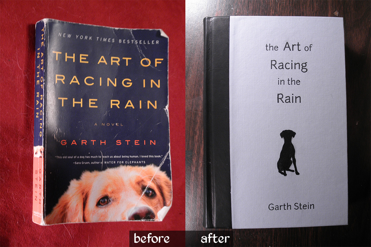
The Art of Racing in the Rain

This book was not what I expected, so I'm glad I read it before I bound it! For some reason I expected it to be about a dog who loves chasing things—you know, good old-fashioned foot-racing.

In fact, this turned out to be a charming, meaningful, and reflective book, written from a dog's perspective, with the rare power to hold my attention while talking about car races. It was reminiscent of the classic Zen and the Art of Motorcycle Maintenance, and certainly a worthy evening's read.

With three themes of its content in mind—dog as armchair philosopher, car races, and rain both real and metaphorical—I set about designing its new look. Enzo the dog takes the main focus, as on the standard cover, this time as a silhouette but with remarkably similar ears. The racing theme found its way onto the endpapers in the form of flying checkers, and a pale blue cover paper sets the rainy theme. For just a touch of class, I used black leather on the spine.


Oh, and I really love adding hand-stitched headbands to books.


I was a little crunched for time on this; my brother wanted it as a birthday present for a friend.  Were I to try again with more time, I'd add some silver detail on the cover—or maybe orange?  I do love blue and orange, and it would maintain more of the original look.

I'm also not entirely happy with the typesetting of the title. Normally I would spend hours obsessing over that!  I might have tried making the dog silhouette full bleed on the left, right against the black leather shoulders, with the title set more to the right... oh well.  It's done now, and all concerned parties have communicated their satisfaction.

Two things that went quite well this time were the spine and the insides of the covers.  I finally realized that I need to crease the shoulders so that the spine is much wider than the text block.  This gives the French grooves more definition, allows the book to open without wrinkling the leather, and gives me wiggle room so that the spine doesn't end up narrower than the rest of the book (a BAD problem).  As for the insides of the covers—by which I mean the cover material which wraps around to the inside—I achieved a very clean, even, square edge on both the paper and leather portions this time around.  Weirdly uneven lumps under the endpapers are not cool!

Leather stamping on a budget

Hey all, I'm back.  It's been a slow couple of weeks since my last post due to visiting relatives, a new workout schedule, and this thing where I need to get a real job.

I thought I'd write a post about how I did the leather stamping on my Tome project, since I think this info could be useful for many others starting out with leather work.

Traditionally, stamping is done with a wide array of specially designed, well, stamps: long metal rods with an inverted design cast on the end.  These range from simple alphabet stamps, to small images and maker's marks, to elaborate filigrees such as those proudly displayed on the site of this professional binder.  There are also tools made in basic shapes like circles, arcs, lines, and polygons for putting together a custom pattern; you can see some in use in this great belt-making video.  You get the idea that, to be able to tool leather the way you want, you're going to need to invest in a lot of specifically designed tools.

Unless you're very clever and patient.

Step 1: Stamp pattern

First we need to create a pattern which will be pounded into the leather to leave an imprint.  All you need for this is a cutout with well-defined edges in a material sturdy enough to withstand a bit of compressive force.  It also needs to be thick enough to sink into the leather. A couple millimeters of thickness is enough, though more is better.

Such a material is not hard to find; shockingly, even paper products will do.  My olive branch stamp was cut out of a piece of collage board.  Here's a list of possible materials and how best to use them:

  • Tagboard / matboard / collage board / layered cardstock:  Anything you can cut out of a piece of cardboard, you can turn into a stamp; it just won't last long. Use this for very customized, one-off patterns; in my case, the olive branches and the volume number "I".

    Be sure, when you cut the pattern, to keep your knife blade perpendicular to the paper; the edges of the pattern must be crisp and square for the best impression.

    Unfortunately, no matter how clean your edges are, they won't survive more than a few uses; even one test use will start to flatten them down.

  • Wire:  For lettering, knotwork designs, curlicues, or maybe even a simple filigree—so long as no strands overlap—use wire.  I used this to make the letters in "VOLUME".

    I'd recommend a thin-gauge craft wire such as the artistic wire available from Hobby Lobby, or any copper-core wire.  (Copper is best because it's soft and easy to shape.)  Square wire may be even better to get a nicer edge shape, though it is harder to find and usually available only in costly silver.

  • Wood:  If you've got a whittling bent, why not use it?  A small block of wood can be carved into any shape, with varying degrees of relief for interior detail.  However, this is likely to suffer the same problem as the paper stamp, in that the edges will lose their crispness over a few uses.

  • Metal sheet:  This would provide the best approximation of a professionally-made stamp and would last quite a long time.  However, it also requires the most special equipment: a jeweler's saw or maybe a band-saw to cut the edges, since a thin, easily cut sheet may not stamp deeply enough.  It might be possible to carve detail in the interior of the stamp, but I don't know what a metal-carving tool is and have no doubt it would make an awful sound.  Maybe a Dremel?

  • Other? I'm sure more possibilities exist...stone, perhaps?  A smattering of sand or small pebbles could produce an interesting texture, though large stones may be too brittle to endure the hammer blows.  Plastic?  Bone?   Coins?  Look around your house and see what you can find already containing an interesting shape or texture -- but be sure it can stand the impact before you test it!

Step 2: Stamping rod

Leather stamps usually come on the end of a long rod, as you recall, but there's no need for the long rod to actually be connected to the stamp.  So all you need to apply the stamp is a thick metal rod a few inches long and a hammer to hit it with.  I sawed off the end of a 1/2"-diameter steel rod that I'd gotten from ACE Hardware, then filed one end flat to lie against the stamp.  Easy.

You may think there's no need at all for the rod part of this setup—you could hit the stamp directly with the hammer—and you're not entirely wrong.  However, the rod gives you a great deal more control over where pressure is being applied, and it keeps stray hammer strokes away from the delicate leather surface (not to mention your fingers).

Step 3: Applying the stamp

Position your stamp carefully.  If it's much larger than the rod, you may want to secure it with tape.  Now, place the rod over an edge and give the top of it a firm smack or two with the hammer, taking care not to let the stamp slip.  Proceed all the way around the edge of the stamp.  Make very sure the stamp doesn't slip at all out of place, or you will kick yourself, I guarantee it.

Be sure that the rod doesn't tilt over the edge of the stamp and leave its own crescent-shaped imprint in the leather, because that will also cause you to kick yourself.  Once an imprint is in, it pretty much doesn't come out.

Most tutorials I watched recommend that you dampen the leather with a sponge before tooling.  My personal experience was that this made no difference, except maybe to dull the leather surface, and I'm not sure why.  Perhaps it varies with leather type; I was using dyed calf leather.  A thicker, stiffer leather, or a raw, untreated leather, may stand in more need of the dampening treatment.

Pros, cons, and cautionary tales

This is a great setup if you're willing to put in a bit of time making the stamps, and have a lot of these materials around or can get them easily.  Custom stamps made in this manner may well be more versatile and easier to use.  Where was I going to find an olive-leaf stamp in exactly the shape I needed?  I could use a shape-elements set like in that video I linked, but that takes a great deal of planning and care; this was quick and easy.

However, if you have to go out to buy every single one of these things—the metal rod, the saw to cut it, the file to smooth it, the wire and pliers, all these various things—then you may be better off just buying a stamp set.  It will last longer and probably look more professional.  Furthermore, this method is not much good for custom tooling, where the tool needs to slide along the surface of the leather; there, you genuinely do need your shape to be attached to the rod.

Last but not least, this method is no good at all for gold leafing.  For that technique the stamp needs to be heated and pressed down with a rocking motion (not hammered), and unfortunately no paper stamp could stand the heat.  However, if all you want is a nice blind tooling, this will do.  Alternatively, you can always apply leather paint afterward for color, which can produce amazing results, too.

I hope others will find this information as useful as I did. If you have advice or suggestions, words to scold me for my cheap, lazy ways, or remonstrations that everyone does this and I'm an unoriginal hack, I'd love to hear them in the comments. Cheers!

Interested in more cheap, clever bookbinding alternatives? Mrs. Dethe at Cursed Cauldron Creations has created a handy list. She, too, is a young bookbinder just finding her way in the craft. Go show her some love!

Tiny books

How to practice the techniques of bookbinding in a non-resource-intensive manner?


Tiny books!  Each is about 2.5" tall and 1.5" wide.  The pages were cut from sheets of tracing paper (which is suitably thin for this scale).


The first is a traditional book on raised cords with a scrap of leather on the spine, and scraps of marbled paper on the covers.  Observe: my first successful French groove!


For the second, I decided to try a coptic binding.  The first such binding I saw was a revelation; a book that shows off the stitching of its own spine?  Wait—you can do that?


Yes.  Yes, you can.  My first try was a little sloppy around the headbands, but I intend to get better.  Here's what it looks like from the inside:


I may add a ribbon to hold it closed; I think my stitches were a little too tight, because this one loves to fly open.  Like a puppy with an open door, I sweartogod.

The next project, currently in the works, is a rose-themed notebook with tear-out pages.  The paper is handmade and contains real rose petals.  Which...might be kind of hard to write on, but I'm counting on it being cool enough that nobody will mind.  (There aren't that many of them.)


The Tome, part VI: Completion

(Enter BINDER, who clears throat.)

BINDER: Allow me to present to you...the Tome, a hand-bound book in its final state.

(Enter BOOK.)

BINDER: It seems to be a little shy, but we'll soon fix that.  For the moment, you can see more here than you might think: the dapper red ribbon, the hand-stitched headband, a bit of Brian's handwriting, the pattern on the endpapers.  A book has a lot to say in its edges and corners.

Still, if you'll bear with me, perhaps I can convince it to show its cover.

(aside, whispering) Only a corner?  All right, that's fine, but you must get it together soon, promise? (addresses audience) We're still getting over our nerves, but here's a detail of the leather.  The headcap was shaped with a piece of yarn and the leather was pressed down around a knotwork relief on the front.  Now let's see if...

Aha!  So, it's not entirely spineless after all!  I think it may be ready.  Ladies and gentlemen...the leatherbound cover of Brian's Tome!

Here you see featured in relief the writer's coat of arms: a sword, two olive branches, and a shield.  Parts of the branches were stamped onto the leather; the rest was pressed down around those cardboard forms I so painstakingly carved.  Beneath you'll find the volume number.  That's correct, Volume I; for I don't expect this man to soon stop writing.  Perhaps next year I'll make Volume II and see how far my craft has come.

Lifting the cover, we get a look at the handsomely marbled endpapers. (As usual, you may click for a larger view of the image.)

Though not hand-marbled, these papers are a step above printed papers and no two are quite the same.  This picture lets you see how the endpapers, ribbon, and headbands have been coordinated in a red-black-yellow scheme.

Now, turning the page...

...we find that the book has been given a title—a nod to the Doctor's own Journal of Impossible Things.

The writer has already begun his work in this volume, but I'm afraid that's not yet ready for display.  We can hope that someday, perhaps, something written in this volume will be lucky enough to catch some publisher's eye; when that happens, I will most certainly show you the manuscript.

(BINDER gives a bow.  Exeunt BINDER and BOOK.)

Thanks for watching.

Go to: Part V | Retrospect

In retrospect...

Of course my first two book projects featured a lot of mistakes. (Finished pictures of the second one are coming, I promise. It's just...there's this thing my camera does where it sucks...)

Anyway, I thought it would be good to go over the things I screwed up and will try to fix for next time. Learning curve, go!

The LotR Poetry Book


Find new cords for the spine.  The hemp yarn I used felt like the right strength and thickness, but its lumpy, tangled fibers were frustrating to fray out for pasting onto the cover boards.  The yarn was also dyed, so wet glue picked up the color and became a vessel for blue stains all over my pages.  I need to find undyed cord with straight, uniform fibers.

Stitch on handmade headbands.  The book looks unfinished without a headband, and no place near me sells the pre-made strips.  I did put a headband on the journal project, but see my comments there; it still needs work.

Allow room for a French groove.  Like headbands, the French groove and raised shoulders next to the spine, which seem to result from a combination of text block backing and careful cover board placement, add a touch of finish and class to the book.  Next time, I'll place the cover boards a little further from the spine to leave room for the groove; but see also this post explaining how to achieve the groove with a split coverboard.

Find an appropriate cloth for the spine.  The red paper I found for the covers is absolutely perfect, both in its vibrant crimson hue and its impressed cloth texture, but the black jeans material on the spine drops the ball.  It's too thick, for one thing, so the unshapely headcap looks even worse with cloth puckering at the corners.  For another, the dense weave picks up whatever dandruff and fluff comes its way.  Lesson learned; just get proper book cloth, available from places like Hollander's, or at least use something thin.

Be glue-conscious.  As careful as I was, it wasn't enough...I got a huge smudge all over the spine cloth, and a few flecks on the title page.  Wax paper and EXTREME caution are required when handling glue.

Embellish the content. The published LotR books universally feature a rich tradition of illustrations and accents from Tolkien's hand. Mine uses only his monogram on the cover, and a very simple three-circle motif on the section headers. Normally I espouse minimalism, BUT the title page, bland as it is, would benefit from an ornament like this Eye of Sauron motif.  Basically, don't under-decorate; the book needs some complexity, especially to fit into a wider tradition.
Learn to hot-stamp gold leaf.  The monogram is already getting scratched, so the adhesive in the kit I bought is under suspicion.  I may have to saw an aluminum stamp and try the advice in this wonderful, illustrated tutorial.

The Tome


Pay attention to paper grain.  This didn't occur to me until I found admonitions published in various tutorials.  Apparently the book goes together much better when the paper grain—of the pages, the cover board, covering material, endpapers, everything—runs vertically.  With this project, I didn't have much wiggle room; to use the full extent of my ledger-size paper, I had no choice but to fold my paper a certain way.  In the future, I'll tend to prefer square or oversize sheets which can be oriented as necessary to suit grain.

Sewing thread is no good for headbands.  Well, unless maybe it's really thick.  Waxed thread is also preferable, else the fibers will start to fray out and look messy.

Use low relief for raising a design under leather.  Even the edge of my kraft-paper hinge was visible through the leather, whereas too high of a relief makes it VERY difficult to mold the leather properly around the design.  A thin applique (only a few paper-widths) is quite sufficient to raise a design under leather; consider this journal, where the edges of the applique seem also to be tapered.  (A higher relief for bands on the spine is fine, as no detail is at risk.)

Not really a mistake, but something I learned on this one: Flour paste is basically awesome.  I still used a lot of PVA glue, which sets more quickly, but flour paste is nice when pasting paper to paper.  It's also ridiculous and fun to see how food becomes a useful structural component of a book.


So, that's all for now.  I'm not really sure what my next project will be, but I've got a lot of materials on hand now.  I'll probably make a journal or a rebound trade paperback, as those are the most marketable options.

The Tome: a quick update

Let's start with good news, then proceed to bad news with a positive spin.

The good news is, I've finished applying the leather and endpapers on Brian's journal. It looks gorgeous and the leather is wonderful to touch; I'm very pleased. So was he.

Now, the bad news: I already gave it to him. More to the point, I don't have pictures yet. Yet. But now he's already started writing it and so, when I do get pictures, they'll be pictures of the book in use. See? Positive spin. Bam.

The Tome, part V: Right, so this part is nervewracking

I'm applying the leather. Like, right this second. I ran upstairs to do a post while waiting for a section to dry.

Scary! But so far, it's going okay; in fact, it's more beautiful than I could ever have hoped. Look how the structure of the cords shows through on the front. I'm surprised that's visible, but I think it looks awesome.

Go to: Part IV | Part VI